 小影邮箱
邮件退订链接怎么放?The Exit That Works
Key Takeaways
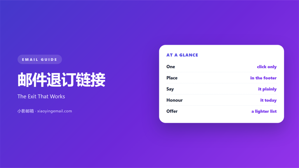
- 邮件退订链接 must work in one click.
- Put it in the footer, in the same place every time.
- Never ask a reader to log in to leave.
- The opt-out should take effect the same day.
- A preference centre can sit beside the link.
What 邮件退订链接 means
邮件退订链接 is the one line in a footer that ends the mail.
It is a plain link, not a form behind a password.
The reader clicks once and the mail stops.
No survey stands between the click and the exit.
No confirmation screen asks them to stay.
A good link is visible in every client.
It sits at the bottom, where footers live.
The words are plain: unsubscribe, opt out, stop these emails.
Those words should never hide behind an icon.
The link belongs to the sender, not to a third party.
It must work for a year after the send, not a week.
That covers the whole promise of the line.
Why 邮件退订链接 matters
A mail without a working exit feels like a trap.
The reader cannot leave, so they mark it as spam.
A spam complaint hurts the whole sending domain.
One clean exit protects every future send.
The link is also a legal requirement in most markets.
A missing or broken link is a compliance failure.
That failure is easy to prove and hard to argue.
Finally, the exit is a signal about list quality.
People who leave were never going to buy.
Their exit makes the remaining list stronger.
The click is the promise
One click should be enough to leave.
Every extra step loses people who already said no.
A reader who gives up marks the mail as spam instead.
That is the worst outcome for everyone.
When 邮件退订链接 helps
It helps most in a regular newsletter.
Readers who tire of the topic leave without complaint.
It helps in a long welcome sequence.
A new subscriber may want fewer mails after a week.
It helps when the list is shared across teams.
One clear exit keeps every team honest.
A 邮件退订链接 also helps during a product change.
People who joined for one thing can leave when it ends.
Put the link where the reader expects it.
A link in every send
Every campaign carries the same footer link.
Do not remove it from a short promotional mail.
A short mail still needs a way out.
Keep the wording identical in every template.
When 邮件退订链接 hurts
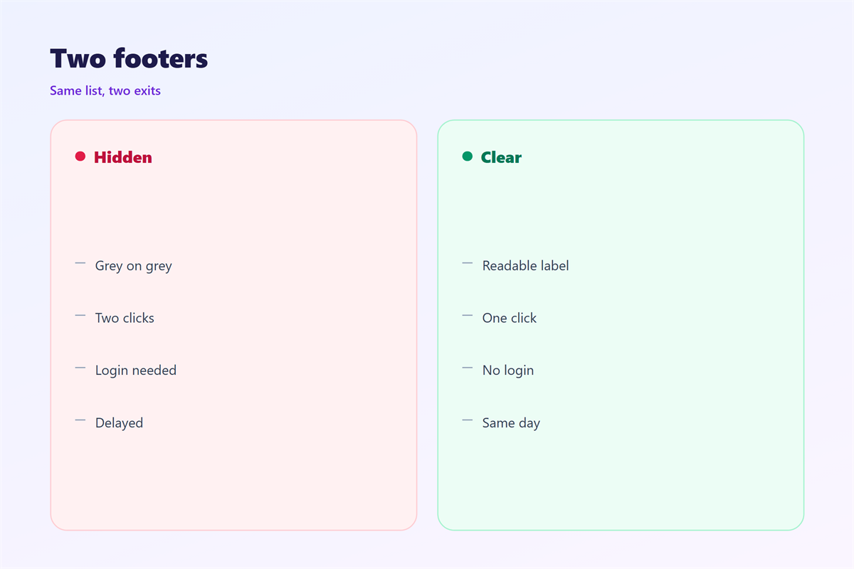
A 邮件退订链接 hurts when it opens a login page.
The reader has forgotten the password by then.
It hurts when the link sits inside an image.
Images are blocked, so the exit disappears.
It hurts when the text is grey on grey.
Low contrast hides the one line that matters.
It hurts when the link leads to a slow page.
Three seconds of waiting feels like a refusal.
It also hurts when the link is missing from some sends.
A missing exit is worse than a slow one.
Finally, it hurts when the opt-out takes a week.
People who wait a week report the mail as spam.
邮件退订链接 and list hygiene
An exit is part of list hygiene, not the opposite.
Every unsubscribe removes a reader who no longer reads.
That raises the share of people who do open.
A 邮件退订链接 also feeds the weekly report.
Count the exits, then look at the reasons.
One topic may cause more exits than another.
That pattern is more useful than the raw number.
Keep the list small enough to matter.
Do not buy names to replace the ones who left.
Suppress, do not delete
Keep the address on a suppression list.
Deleting it invites an accidental re-add.
The list also proves you honoured the request.
Review it once a quarter for mistakes.
Then the record stays clean and defensible.
How to place 邮件退订链接
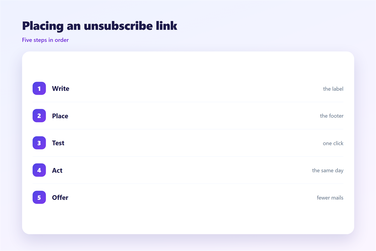
Place the 邮件退订链接 in the footer, above the address.
Keep it on its own line with space around it.
Use live text at fourteen pixels or larger.
Write the words in plain language, not in legal code.
Link the whole phrase, not one small word.
Test the link from three different mail clients.
Then test it on a phone with images turned off.
Confirm that the opt-out lands on a working page.
One click, same day
The click should confirm the exit at once.
Write one short line that says the mail has stopped.
Do not offer a discount to undo the request.
Process the change on the same day.
Then check the suppression list the next morning.
Log the time of each request for the record.
邮件退订链接 on a phone
Most exits now happen on a phone.
The footer is the last thing a thumb reaches.
Keep the link away from the very bottom edge.
Leave a finger-width of space below it.
Make the tap area at least forty-four pixels tall.
Use a clear colour that survives dark mode.
A 邮件退订链接 in light grey vanishes at night.
Test the link in dark mode before every template change.
Also check that the page behind it is mobile friendly.
A desktop-only form loses most of its visitors.
Keeping 邮件退订链接 honest
A working link is only the first promise.
The page behind it must be short and clear.
That page is covered in 邮件退订页.
The weekly number is read in 邮件退订率.
A softer option sits in 邮件偏好中心.
The legal floor appears in 邮件合规.
Read all four before changing the footer.
Then write one rule for the whole team.
Never let a campaign skip the link to look cleaner.
Review the footer text once a year.
Keep the old wording if it still works.
FAQ
Where should a 邮件退订链接 sit?
In the footer, on one line, in every mail.
Must the reader log in to leave?
No. A login step turns a clean exit into a complaint.
How fast should the opt-out work?
Same day. A week of delay invites spam reports.
Can a preference centre replace the link?
Offer both. One click to leave, one click to choose less.
评论
还没有评论,来说两句吧。
评论功能已关闭。