 小影邮箱
邮件网格怎么排?A Grid That Holds
Key Takeaways
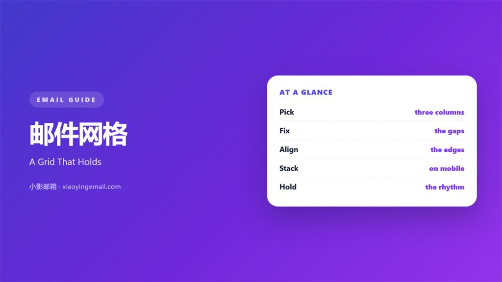
- 邮件网格 is the set of columns and gaps behind a layout.
- Pick two or three columns, not twelve.
- Keep the same gap everywhere.
- Align text to one left edge.
- Let the grid collapse in a clear order on a phone.
What 邮件网格 means
邮件网格 is a simple frame for placing blocks.
It sets the width of each column.
It also sets the space between them.
A grid is not a visible line on the page.
It is the rule behind the page.
Most emails use a fixed width near six hundred pixels.
That width fits a desktop preview without scrolling.
Inside it, two or three columns are enough.
More columns add decisions, not clarity.
The grid should survive a narrow screen.
On a phone, columns usually stack.
A good 邮件网格 makes that stack feel planned.
Why 邮件网格 matters
Readers do not see a grid.
They feel whether a page is steady.
A steady page is easier to trust.
When blocks share an edge, the eye moves faster.
When gaps change, the eye stops.
Small stops add up.
A reader who stops twice may close the mail.
A clear 邮件网格 also speeds up the build.
You place a block once and reuse the position.
Then a new campaign takes an hour, not a day.
Structure is not decoration
A grid does not need to show itself.
Its job is to keep the content calm.
If a reader notices the layout first, it is too loud.
When 邮件网格 helps
邮件网格 helps when a note holds more than one idea.
Two offers side by side need a shared frame.
A product and its price need a clear edge.
It helps a weekly digest most of all.
Each story gets the same width and the same gap.
Readers learn where to look.
It also helps a team build faster.
Everyone places content in the same slots.
The result looks planned without a designer.
It helps when the brand has many writers.
Two columns beat four
Two columns are easy to scan and easy to stack.
Four columns turn into thin strips on a phone.
If you need four items, use two rows of two.
When 邮件网格 hurts
邮件网格 hurts when it is too tight.
Text pressed against a column edge feels rushed.
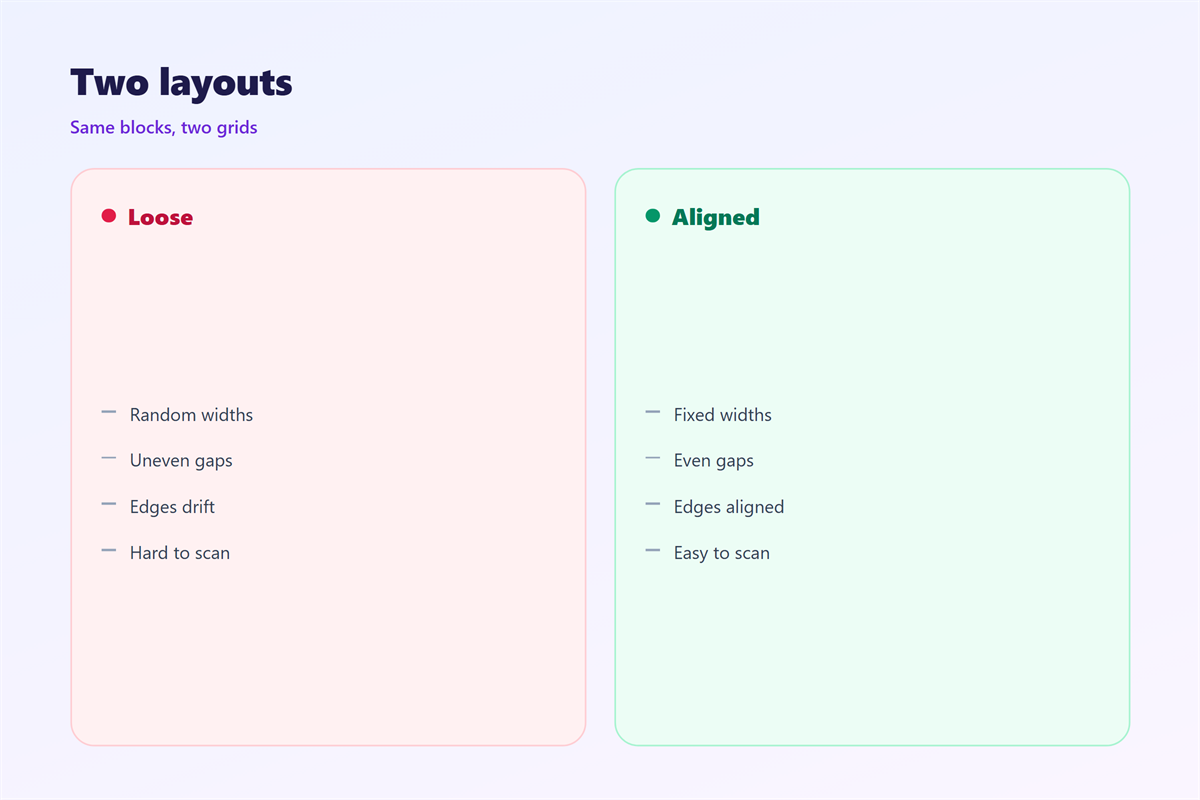
It also hurts when the gaps are uneven.
A tight 邮件网格 makes every block feel crowded.
A twelve-pixel gap here and a twenty there looks broken.
Readers may not name the problem, but they feel it.
It hurts when the grid fights the content.
A long headline cannot live in a narrow column.
Forcing it there creates three ugly line breaks.
Finally, it hurts when the mobile order is ignored.
Columns that stack at random tell the wrong story.
A price can land above the product it belongs to.
That mistake costs sales.
邮件网格 and columns
Start with the content, then choose the columns.
One column suits a letter or a single offer.
Two columns suit a product and its details.
Three columns suit a short list of links.
Beyond three, the phone version suffers.
Set one gutter value and keep it.
Sixteen or twenty pixels works for most layouts.
Use the same value between rows.
Then the whole page breathes at one rhythm.
Build with tables, not hope
Email layout still leans on tables.
A table holds its shape in strict clients.
Use one table for the frame and simple cells inside.
Do not nest five levels deep.
Deep nesting breaks in ways that are hard to trace.
How to use 邮件网格 well
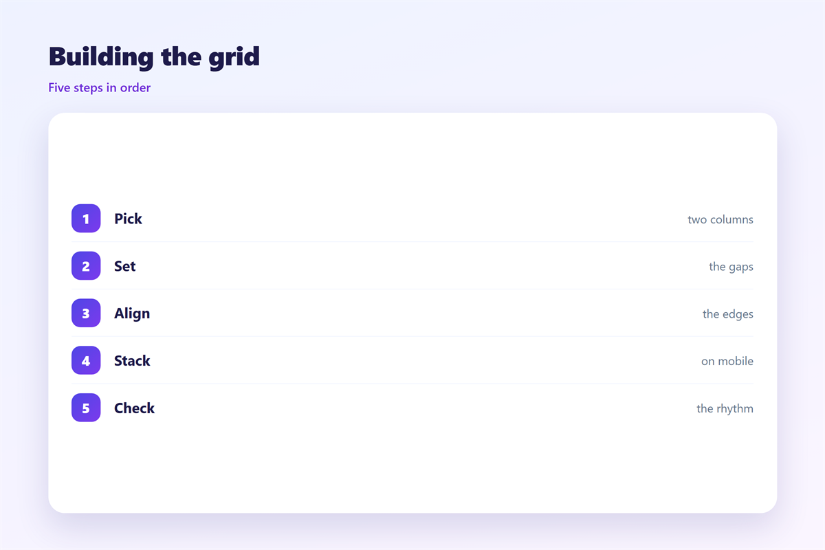
Sketch the page on paper first.
Draw the columns and the gaps by hand.
Then set the outer width to six hundred pixels.
Choose two or three columns inside it.
Align every heading to the same left edge.
Give images the full width of their column.
Keep body text in one column, never two.
Use a single gutter value everywhere.
Then check the page with the images turned off.
The blocks should still hold their places.
If they do not, the grid is doing too much work.
邮件网格 on a phone
A phone turns every row into a stack.
That stack needs a clear order.
Put the main idea first in the code.
Then the image, then the price, then the button.
Do not rely on the desktop position to decide.
The code order is the phone order.
Keep the side margins at least sixteen pixels.
Then the text has room to breathe.
Test with a long subject and a long headline.
The 邮件网格 should bend, not break.
Keeping 邮件网格 honest
A grid should serve the reader, not the template.
If a block needs more room, give it more room.
The column side lives in 邮件分栏.
The wider craft sits in 邮件排版.
Text edges are covered in 邮件对齐.
Space around blocks appears in 邮件留白.
Then write the values in the template notes.
Name the width, the columns, and the gutter.
Review the grid when a new block type arrives.
One change can break a dozen old campaigns.
A team that keeps one 邮件网格 ships faster.
FAQ
How many columns should 邮件网格 use?
Two or three. More columns become thin strips on a phone.
Should I use a twelve-column grid?
No. Email is not a web page. A simple frame survives better.
What gutter works best?
Sixteen pixels is a safe start. Keep it the same everywhere.
Can I mix two grid styles?
Avoid it. Mixed frames make the page feel assembled from parts.
评论
还没有评论,来说两句吧。
评论功能已关闭。