 小影邮箱
邮件贴纸怎么用?Small Marks of Delight
Key Takeaways
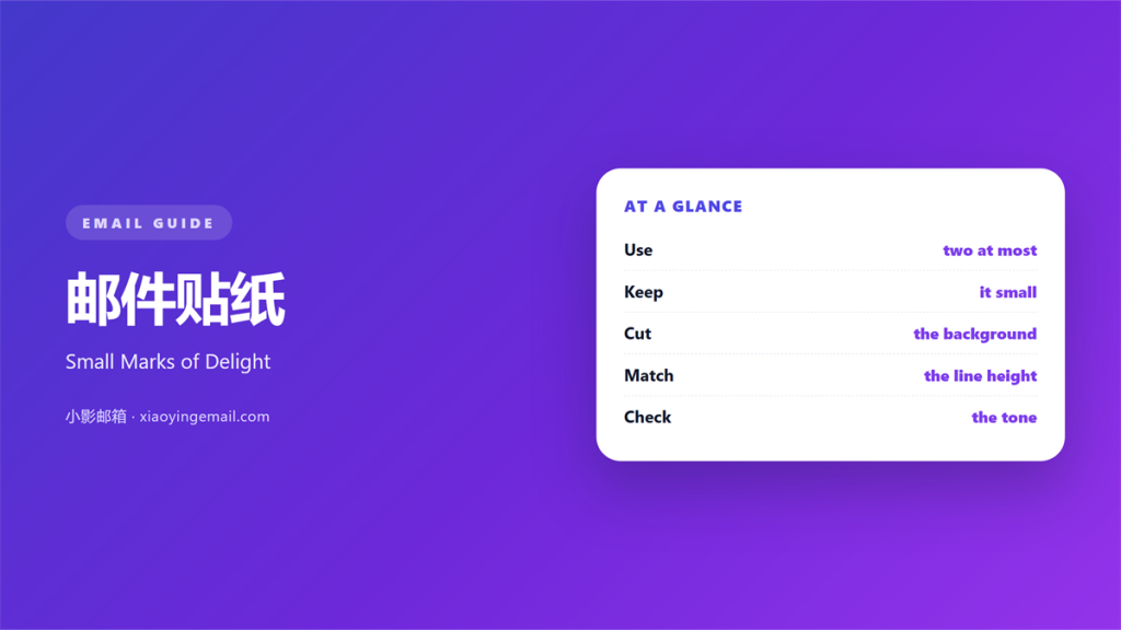
- 邮件贴纸 is a small graphic placed beside the words.
- Two per mail is a sensible limit.
- Export each mark as a transparent PNG.
- Keep the sticker off the text.
- Match the mark to the brand voice.
What 邮件贴纸 means
邮件贴纸 is a small graphic that sits beside the words.
It looks like a sticker pressed onto paper.
It can be a star, a squiggle, or a tiny flag.
It is drawn, not photographed.
Most stickers have a transparent background.
That lets them sit on a coloured panel.
They are decoration with a job.
That job is to add tone, not information.
A sticker never carries a price or a date.
It takes up little space in the layout.
Two per mail is a sensible limit.
Beyond two, the mail starts to look busy.
Why 邮件贴纸 matters
A plain mail reads like a notice.
A small mark makes it feel written by a person.
A 邮件贴纸 softens an instruction without changing it.
That warmth is hard to get from type alone.
It also gives the eye a landmark.
Readers remember where the sticker sat.
The memory is vague but useful.
It separates two blocks without a rule.
It gives a long column a place to pause.
It can echo a brand shape or mascot.
That echo builds recognition across sends.
A small budget
Treat stickers like a small budget.
Spend two in a mail and stop.
The limit makes each one mean more.
A mail with none is not missing anything.
When 邮件贴纸 helps
It helps in a welcome mail.
A new reader needs a friendly signal.
It helps in a short transactional note.
One sticker takes the chill off a receipt.
A 邮件贴纸 helps when the brand voice is light.
Playful brands can use it often.
It helps beside a single call to action.
A small arrow or star points the way.
A thank-you note also carries one well.
Where it fits
Place it beside a heading, not inside it.
Or set it at the end of a short sentence.
Keep it out of the first line of body text.
That line should read without decoration.
When 邮件贴纸 hurts
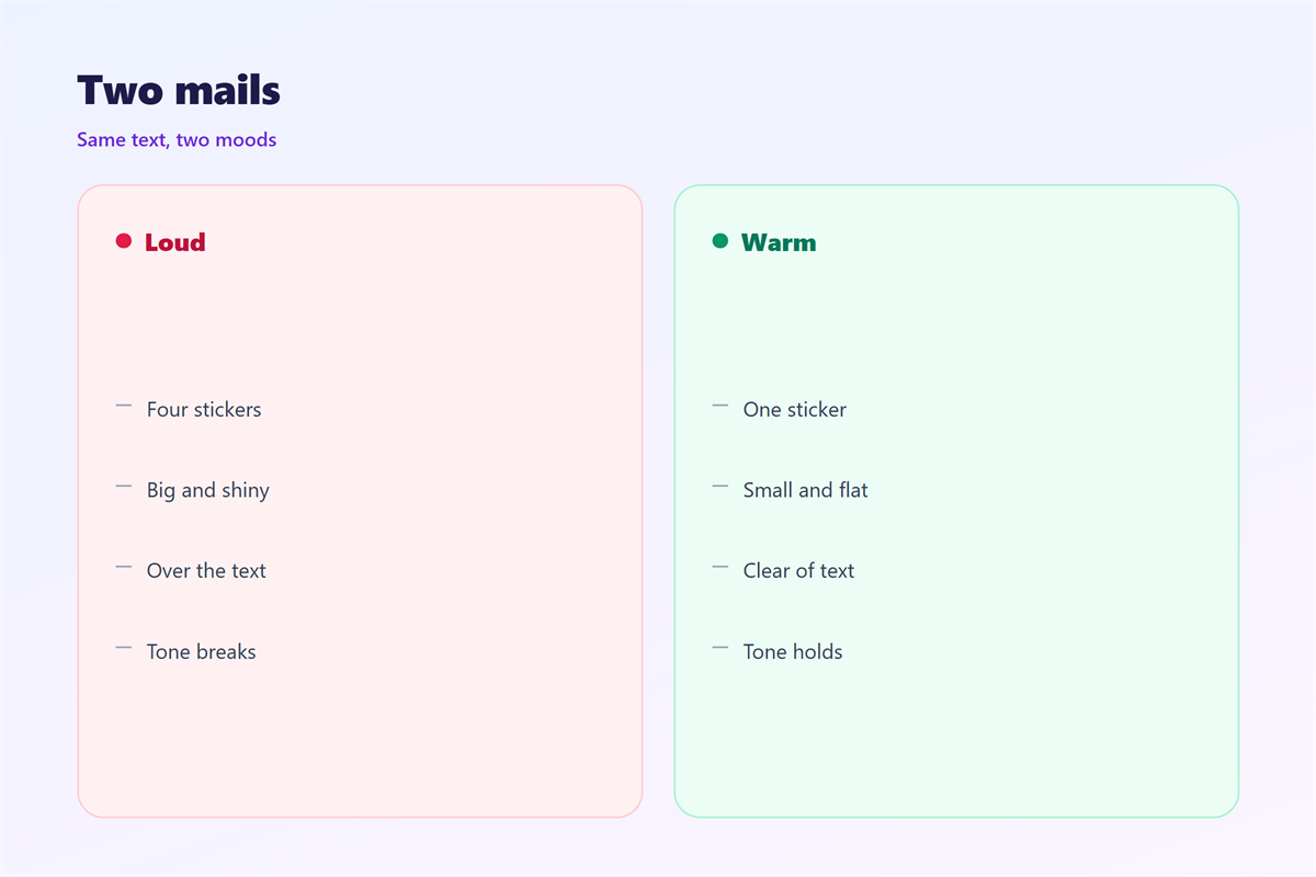
A 邮件贴纸 hurts when it lands on text.
A sticker over a word hides the word.
It hurts when the file has no transparency.
A white box around the mark looks like a patch.
It hurts when the sticker is too large.
A mark taller than the line breaks the rhythm.
It hurts when three or four appear in one screen.
The mail starts to look like a scrapbook.
Stickers hurt a serious message.
A condolence note needs none at all.
They also hurt when the style changes every send.
A sticker that repeats an emoji adds nothing.
Pick one family of marks and keep it.
邮件贴纸 and brand voice
A 邮件贴纸 speaks before the copy does.
A rough hand-drawn star says friendly.
A precise geometric dot says modern.
Neither is wrong, but they are not the same.
Match the mark to the words around it.
A formal bank mail with a cartoon feels odd.
A craft shop with a sterile icon feels odd too.
The sticker is a small promise about tone.
Ask whether the mark would survive in print.
Break that promise and the mail feels off.
One family, many uses
Choose three marks from one illustrator.
Use them in rotation for a year.
Then the set becomes recognisable.
New marks can join the same family.
That keeps the voice steady across campaigns.
How to use 邮件贴纸
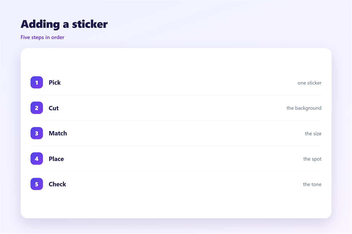
Start with the sentence the sticker will sit beside.
Read it aloud and decide the tone.
Then pick a mark that matches that tone.
Export it as a transparent PNG.
Keep the height close to the line height.
A 24 pixel mark suits 16 pixel text.
Place it in its own table cell.
That keeps it off the words.
Leave a small gap between mark and text.
Name each file by mark and size.
Then check the mail with images blocked.
Check the edges
Open the PNG on a dark background.
Any white fringe will show there.
Trim the canvas to the drawing.
Then the spacing behaves as planned.
Repeat the check for every mark in the set.
A tidy file saves work later.
邮件贴纸 on a phone
A sticker shrinks with everything else.
A 24 pixel mark becomes tiny on a phone.
Keep the mark at 20 pixels or more.
Or drop it on small screens.
A 邮件贴纸 is optional by design.
So hiding it costs nothing.
Never let it push the text sideways.
Place it after the sentence, not before.
That keeps the left edge clean.
A separate cell also keeps the tap target clean.
Then test the mail on a real phone.
Watch the wrap
A sticker inside a line can force a wrap.
Keep it in a separate cell instead.
Then the text wraps on its own.
The mark follows without breaking the line.
Keeping 邮件贴纸 honest
A sticker should not pretend to be a button.
If it looks tappable, readers will tap it.
Then they land nowhere and trust the mail less.
The icon rules sit in 邮件图标.
The wider decoration question is covered in 邮件装饰.
The first image has its own guide in 邮件封面.
Colour choices are discussed in 邮件配色.
Then write down where stickers may appear.
A short rule keeps the look consistent.
Then a 邮件贴纸 stays decoration, not a claim.
Review the set once a year.
FAQ
How many 邮件贴纸 can one mail hold?
Two. One is often enough for a short note.
Does a sticker need a transparent background?
Yes. A white box will show on any coloured panel.
Can a sticker sit over a photo?
Rarely. It usually hides detail and muddies the image.
Do stickers work for every brand?
No. Serious or formal voices read better without them.
评论
还没有评论,来说两句吧。
评论功能已关闭。