 小影邮箱
邮件下划线该不该用?When a Line Sends the Wrong Sign

Key Takeaways
- 邮件下划线 draws a line under a word or phrase.
- Readers often read that line as a broken link.
- Bold or italic usually stresses a word better.
- Keep an underline rare and never decorative.
- Test the result on more than one mail client.
What 邮件下划线 means
邮件下划线 is a line drawn under a run of text.
It is a simple format you can add in most clients.
The mark began as a way to show emphasis.
The mark has a long history in print.
It was meant for handwriting on paper.
Then the web gave the same line a new job.
On a web page, an underline usually means a link.
So the meaning of the line has shifted over time.
In mail, the old and the new meanings now clash.
The line can be thin, thick, or double.
A double line often reads as a heading rule.
In plain text, people fake the line with dashes.
Each version sends a slightly different signal.
Keep that clash in mind before you use it.
Why 邮件下划线 causes trouble
The first problem is a false signal.
Readers expect an underlined word to be clickable.
When it is not, they feel a small stumble.
A busy reader may click the fake link at once.
When nothing happens, they pause and lose focus.
That small pause adds up across a long thread.
So a needless line slows the whole message.
邮件下划线 also fights with real links in the same note.
So a stray 邮件下划线 can break the reader’s trust.
A second problem is legibility.
A line under text can cut through the letters below.
On some fonts it makes the words harder to read.
A third problem is that the line can look dated.
Older mail styles used it far more than we do now.
Today it reads as a leftover habit, not a choice.
Accessibility and colour
Some readers cannot tell colours apart.
For them, a coloured word may look plain.
So they lean on other cues, like the underline.
But a fake link can mislead them too.
Clear wording beats a subtle mark.
When 邮件下划线 is acceptable
There are a few narrow cases for a line.
A price or a total may sit under a short rule.
A rule under a total can guide the eye to a figure.
A signature block may use a line as a divider.
A form field may show where to type.
A divider helps when a note has two clear parts.
Keep the line short and close to what it marks.
Keep the use rare
Rare use keeps the mark meaningful.
If you underline often, the signal weakens.
Reserve the line for a true divider or a link.
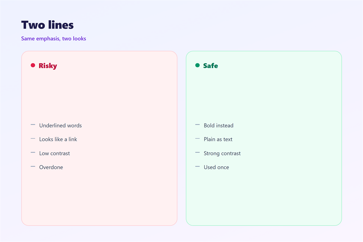
Never underline a full sentence for emphasis.
邮件下划线 and links
A real link is the one honest use of the line.
Keep that style for links and nothing else.
A link is easy to spot when it is the only line.
If you underline plain text too, the link loses its edge.
That blur costs the reader a moment of doubt.
Then a reader learns one simple rule.
A line means a tap, and no line means plain text.
That rule saves a reader from wrong guesses.
Consistency here is a quiet kindness.
Better ways to stress a word
Bold is the safest way to add weight.
It marks a word without a link-like line.
Italic works for a light nudge or a title.
A short sentence can carry stress on its own.
Word choice often beats any format at all.
A darker colour can add weight without a line.
A short heading in bold can mark a new part.
Blank space alone can separate two blocks.
None of these need a 邮件下划线 at all.
Pick the lightest tool that does the job.
Use it once, then trust your words.
邮件下划线 in plain text
Plain text has no real bold or italic.
So people mark stress with stars or capitals.
Some use underscores around a word instead.
That trick looks close to 邮件下划线.
It can also confuse a reader on a small screen.
A row of dashes can look like a divider instead.
Use capitals once and leave the rest plain.
A clear sentence needs no extra mark.
Common 邮件下划线 mistakes
One mistake is underlining a whole greeting line.
Another is mixing underlines with real links.
A third is using the line just to decorate.
Some writers underline a whole paragraph by habit.
Others draw a line under an empty space.
A stray line can also hide a true link nearby.
Fewer marks usually read as more care.
Each of these weakens a clean message.
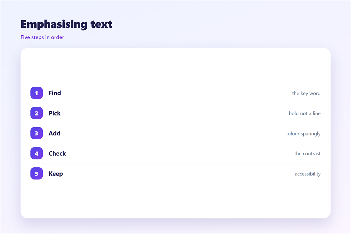
Review each underline against its job.
If it has no job, remove it.
Keeping 邮件下划线 rules consistent
A fixed rule helps every reader in a team.
A style guide can settle the question for a team.
New members then learn the rule in a day.
The wider page is planned in 邮件排版.
The typeface is chosen in 邮件字体.
The choice between plain text and markup is set in 邮件格式.
The needs of every reader are covered in 邮件可访问性.
Then apply the same rule to each message.
A team that limits 邮件下划线 writes clearer mail.
FAQ
Should I underline a word for emphasis?
Usually not. Bold is a safer choice.
Why do readers mistake 邮件下划线 for a link?
Because a line under text has meant a link for years.
Can 邮件下划线 hurt accessibility?
Yes, a false link can mislead some readers.
Is a divider line the same thing?
No. A divider sits between blocks, not under a word.
评论
还没有评论,来说两句吧。
评论功能已关闭。