 小影邮箱
邮件品牌怎么体现?A Brand You Recognise
Key Takeaways
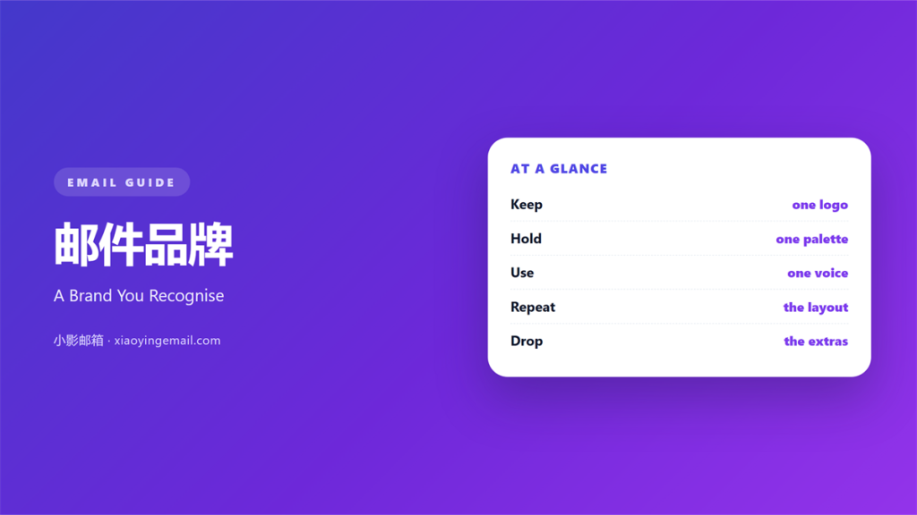
- 邮件品牌 is the impression a reader keeps after one message.
- It shows in small repeated choices, not one big logo.
- Colour, type, and voice must agree.
- A steady brand earns trust before the offer is read.
- Drop any element that fights the rest.
What 邮件品牌 means
邮件品牌 is the character your messages carry.
It is built from colour, type, spacing, and tone.
Readers rarely name it, but they feel it.
A message from a known brand looks familiar at a glance.
That glance happens before a single word is read.
So the logo sits in the same place every time.
The same grey line divides every section.
The same voice opens and closes the note.
邮件品牌 is not a single campaign.
It is the sum of a hundred small decisions.
One odd send weakens the pattern.
Two odd sends make the pattern unclear.
Colour arrives before the copy does.
A single red block can say more than a paragraph.
The type should look calm at small sizes.
Why 邮件品牌 matters
Trust arrives before the offer does.
A familiar look buys the reader’s first second.
That second decides whether the rest is read.
A steady look also saves work.
The team stops debating every colour and margin.
New writers follow the same short rules.
The output stays even when people change.
邮件品牌 also survives a crowded inbox.
Readers sort by sender and by shape.
A recognisable shape gets opened first.
The same holds on a busy Monday morning.
A steady sender is a small relief.
Recognition is a quiet advantage
Nobody praises a consistent header.
They simply stop hesitating.
That pause is where most mail dies.
When 邮件品牌 helps
邮件品牌 helps when the list is mixed.
New readers need a reason to trust you fast.
Returning readers need the same cues again.
It helps when several people write the mail.
A shared set of rules keeps the voice close.
It also helps during a launch.
A new product feels safer inside a known frame.
The frame carries the trust the product has not earned yet.
A frame for every send
Think of the frame as a picture mount.
The content changes; the mount stays.
Readers learn the mount and skip to the content.
When 邮件品牌 hurts
邮件品牌 hurts when the rules become rigid.
A template that never changes starts to feel dead.
It also hurts when the logo shouts.
A giant mark pushes the message down the page.
Brand is not the same as decoration.
Another risk is a voice that does not match.
A playful note from a serious firm confuses readers.
Worse is a serious note from a playful firm.
The mismatch costs more than the design.
Finally, avoid copying a rival’s look.
Readers will file you under their name.
A borrowed look also hides what makes you useful.
Keep the parts that are truly yours.
邮件品牌 and consistency
Consistency is the cheapest brand tool you own.
Pick one accent colour and keep it.
Pick two fonts and stop there.
Set one width for the whole message.
Then hold those choices for a year.
Changing them monthly erases the memory.
A reader needs a few months to learn the pattern.
Give that pattern time to settle.
邮件品牌 grows from repetition, not novelty.
Write the rules down
A short sheet beats a long debate.
List the colours with their codes.
List the fonts and their sizes.
Add one line about the voice.
Then share it with everyone who sends.
How to use 邮件品牌 well
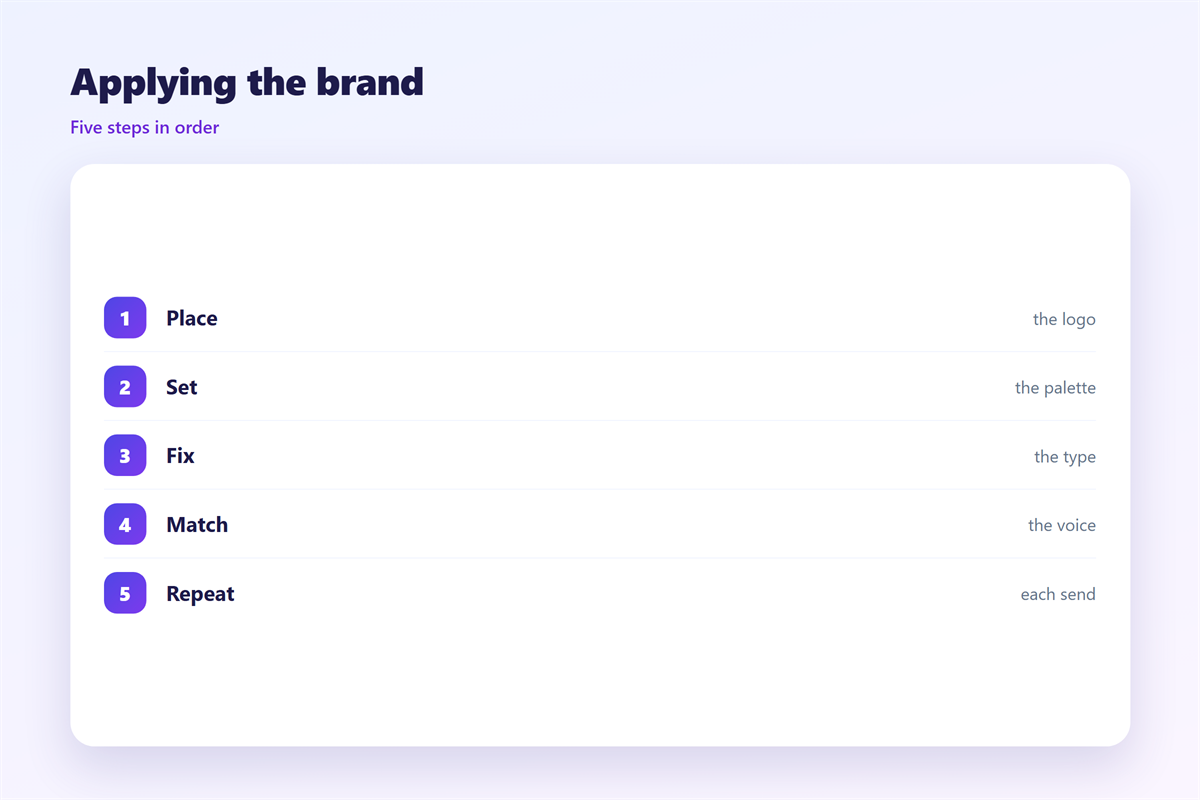
Start with the parts readers see first.
The sender name should match the brand.
The subject line should sound like the firm.
The header should carry the mark at a modest size.
Then keep the body calm and plain.
Use the accent colour for one action only.
Let white space do the dividing.
End with a sign-off that fits the voice.
邮件品牌 is built by these small repeats.
Review one old send each month.
Ask what a stranger would remember.
One action, one colour
If every button is orange, none stands out.
Keep the accent for the main click.
Secondary links can stay plain text.
That single rule fixes most busy layouts.
邮件品牌 on a small screen
Most readers meet the brand on a phone.
A wide header may be cropped at the edges.
Test the mark at a narrow width.
Keep the name readable without the logo.
Stack the header and the headline.
Let the type stay large enough to read.
Then check the sign-off too.
Many layouts break at the very bottom.
A brand looks careless when the last line wraps.
邮件品牌 survives when the small screen is designed first.
Build the phone version before the desktop one.
A narrow layout forces the hard choices early.
Keeping 邮件品牌 honest
A brand is a promise repeated.
Only promise what you can deliver.
If the look says premium, the service must match.
Small gaps between word and act are noticed.
The parts live in 邮件模板, the palette in 邮件配色, the ending in 邮件落款, and the top strip in 邮件横幅.
Then keep one shared file for the rules.
Review it twice a year.
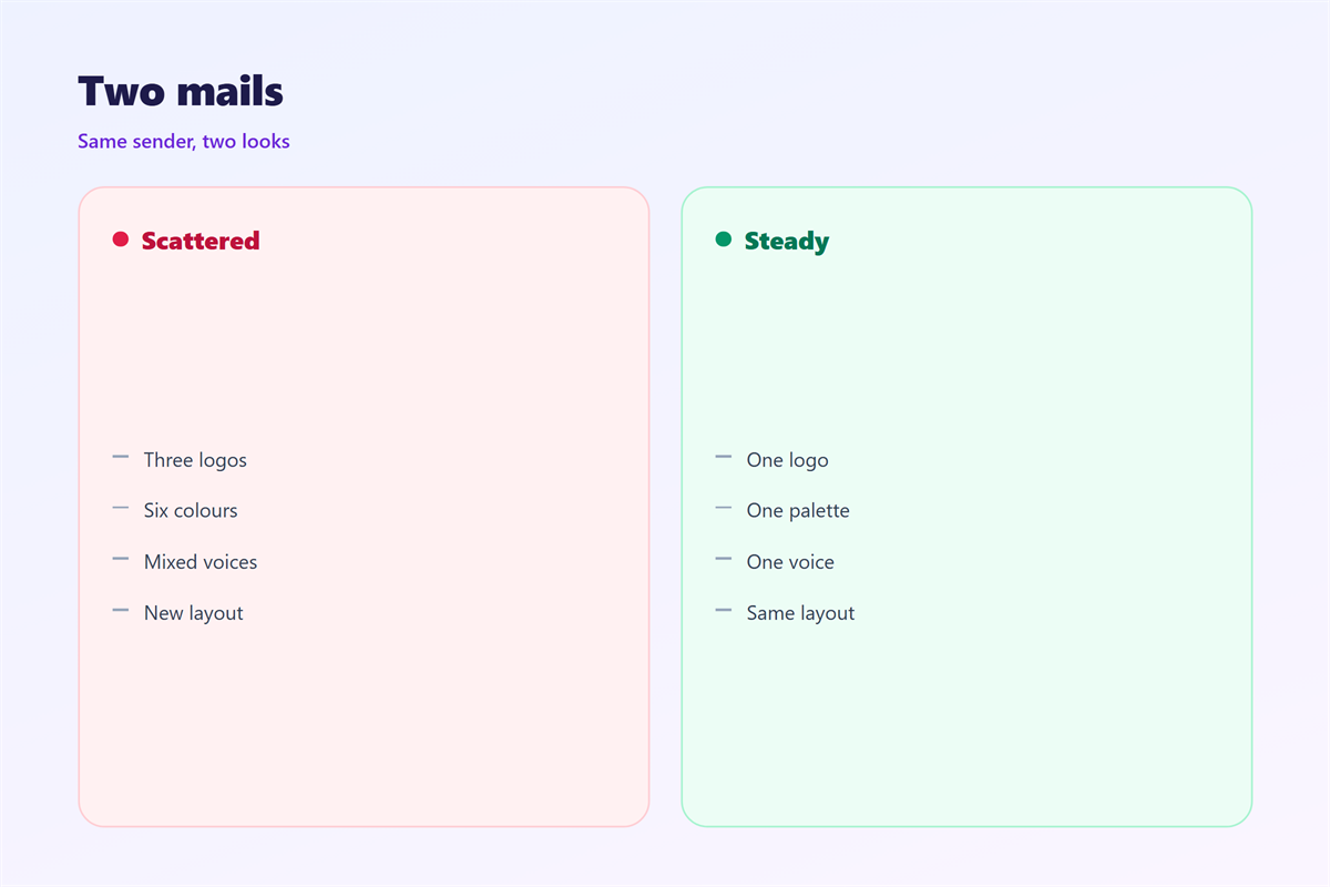
A brand that never changes starts to age.
A brand that changes weekly never forms.
Both faults are easy to avoid with one page of notes.
FAQ
Does 邮件品牌 need a logo in every mail?
No. A clear sender name often does more. Use the logo where it helps recognition.
Can one template serve every message?
A base frame can. Keep the content blocks flexible inside it.
How many colours are enough?
One accent plus two neutrals. More colours make the hierarchy harder to read.
How do I know the brand is working?
Readers recognise the sender without the subject line. Ask a few of them.
References
- Litmus: Email design and rendering guides
- Campaign Monitor: Email marketing resources
- Nielsen Norman Group: Visual design and writing
评论
还没有评论,来说两句吧。
评论功能已关闭。