 小影邮箱
邮件高亮怎么用?Highlight the Right Words
Key Takeaways
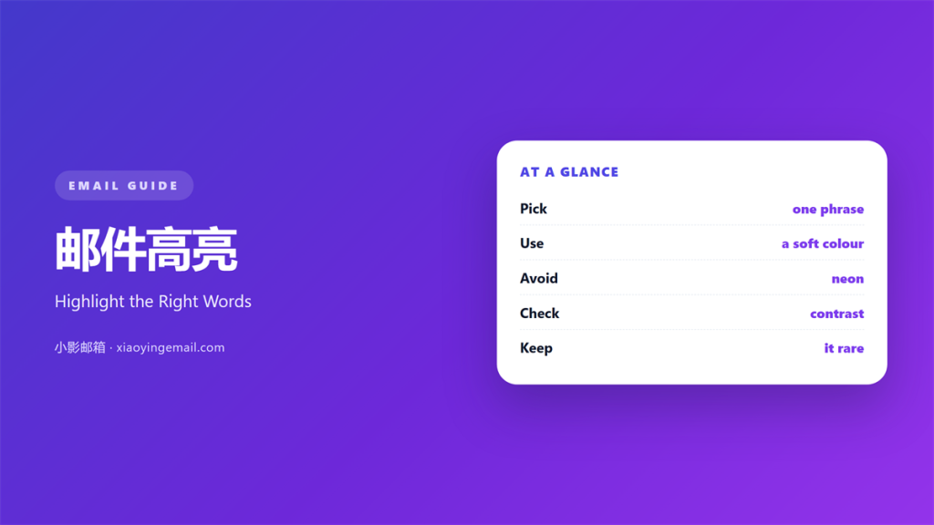
- 邮件高亮 marks the one line that truly matters.
- Pick a soft colour and use it once.
- Never highlight a whole paragraph.
- Too many marks hide the real point.
- Test how the colour looks on a small screen.
What 邮件高亮 means
邮件高亮 is the habit of colouring a few words.
The colour lifts those words off the page.
It works like a marker on paper.
The effect is loud and easy to spot.
So the skill is knowing when to use it.
Most notes need no highlight at all.
Think of 邮件高亮 as a flare in the dark.
A flare helps only when the night stays dark.
In daylight, the flare means nothing.
So a mark works only when it is rare.
One clear mark beats five faint ones.
Why 邮件高亮 matters
Some lines must not be missed.
A deadline or a price can carry real weight.
A touch of 邮件高亮 makes that line stand out.
The reader sees it before they read the rest.
That saves time for both of you.
It also reduces the chance of a missed step.
Used with care, a highlight guides the eye.
Used without care, it adds noise.
A single mark can also set the tone.
It tells the reader what to do first.
What a highlight cannot do
It cannot fix a message with no clear point.
It cannot make a weak offer strong.
So fix the structure first, then add a mark.
When 邮件高亮 helps
A highlight earns its place in a few clear cases.
Use it for a deadline the reader must not miss.
Use it for the single action you want them to take.
Use it for a number that carries real weight.
And stop there. A few cases are plenty.
Each case should have a clear reason.
If you cannot name the reason, drop the mark.
A mark without a purpose just distracts.
For a deadline
A date in a calm page can slip past the eye.
A soft highlight brings that date forward.
Keep the mark on the date itself.
For one action
Mark the single step you want the reader to take.
One mark keeps the ask clear.
Two marks split the reader’s attention.
When 邮件高亮 hurts
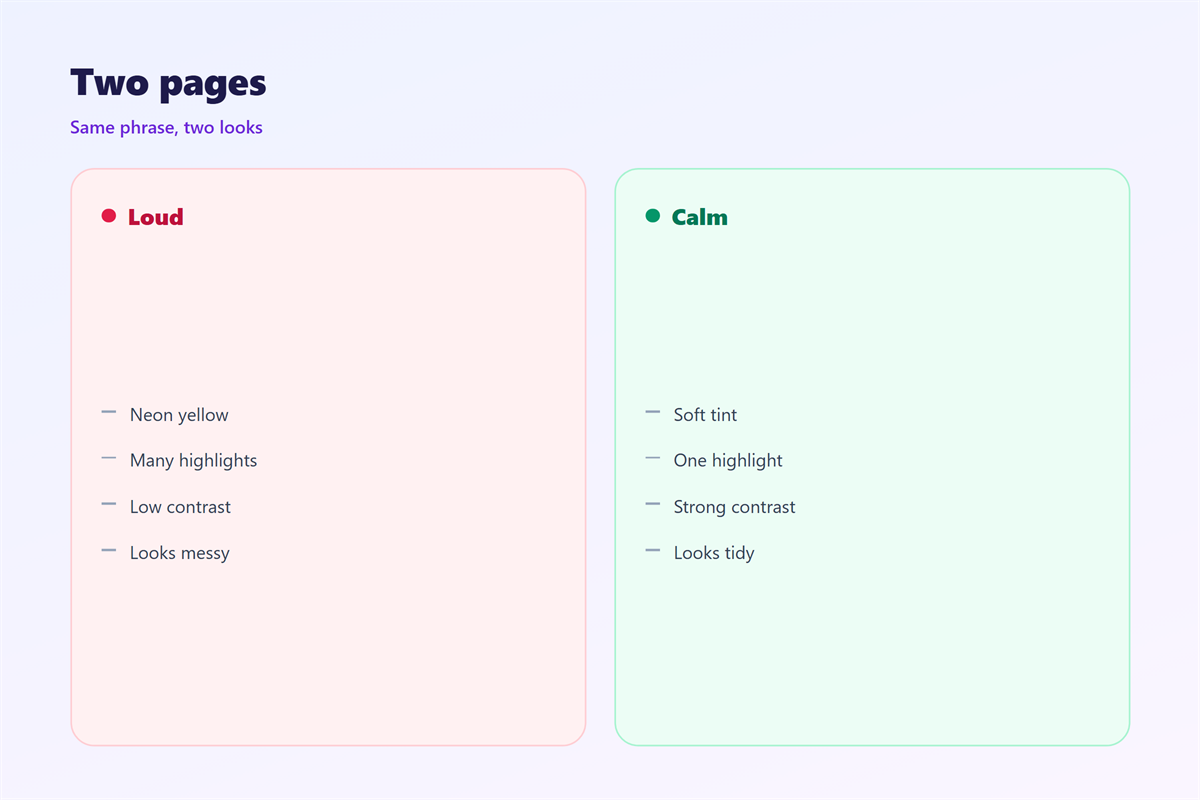
A page full of colour reads like an alarm.
When everything glows, nothing does.
Bright colours can also look pushy.
They can turn a calm note into a demand.
Some colours carry hidden meanings too.
Red may read as an error or a warning.
So count your highlights before you send.
The colour trap
A strong colour is the easiest one to misuse.
Pick a soft, low-contrast shade instead.
A gentle mark guides without shouting.
So test the shade on a small screen first.
A shade that looks soft may still glare.
How to use 邮件高亮 well
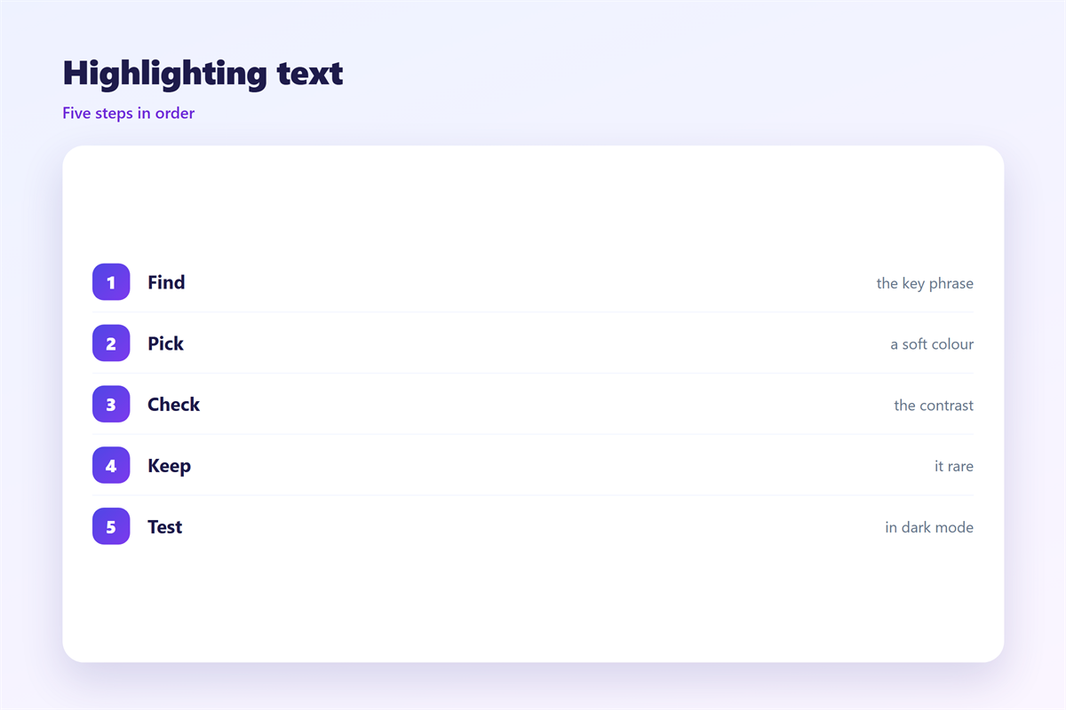
A highlight works best on a few words.
Keep the marked part under five words.
Mark a date, a number, or a short phrase.
Then read the message again on a small screen.
If the colour is too loud, soften it.
Good 邮件高亮 is easy to miss in the best way.
The reader just finds the key line fast.
Next, check the whole page at a glance.
Count the coloured spots with your thumb.
If more than one area glows, remove a mark.
Then send a test copy to yourself.
Check the colour on a phone and a desktop.
邮件高亮 and accessibility
Colour alone is never enough to carry meaning.
Some readers cannot tell certain shades apart.
A screen reader may not announce a colour change.
So add clear words to explain the key point.
Never rely on 邮件高亮 to stand alone.
Write the sentence so it works without the colour.
Test with a screen reader if you can.
A clear sentence helps more than a bright mark.
Add a label or a bold word beside the colour.
That way the point survives without the shade.
邮件高亮 across clients
Colour behaves differently from one app to the next.
Some clients show the mark as expected.
Others strip the tags and send plain text.
In plain text, the colour disappears completely.
Dark mode can also change how a shade looks.
So plan for the plain version. It may be the only one.
A message that reads well without 邮件高亮 is safest.
Write the plain version first. Then add a soft mark.
Test the note in two or three apps.
Note where the colour holds and where it fades.
Keeping 邮件高亮 consistent
Consistency turns a small rule into a habit.
Pick a house style and hold it across the team.
The wider layout behind good emphasis is covered in 邮件排版.
The typeface behind the mark is explained in 邮件字体.
The rules that keep mail readable for all appear in 邮件可访问性.
The choice between rich text and plain text appears in 邮件格式.
Agree on one house colour for highlights.
Keep that colour for every message you send.
Then review the rule after a few weeks.
A short check keeps the habit from slipping.
A team that agrees on 邮件高亮 writes cleaner mail.
FAQ
How much 邮件高亮 is too much?
More than one highlight in a short note is usually too much.
One mark per note is a safe default.
Which colour should I use?
Pick a soft, low-contrast shade that stays easy to read.
Avoid pure red and bright neon tones.
Can a highlight replace bold text?
Often yes. Pick the lightest tool that does the job.
Bold and colour both add weight to a line.
Does a highlight work in every mail app?
No. Some clients strip it, so the plain version must read well.
Test the note before you send it.
评论
还没有评论,来说两句吧。
评论功能已关闭。