 小影邮箱
邮件配色怎么选?Colours That Read Well
Key Takeaways
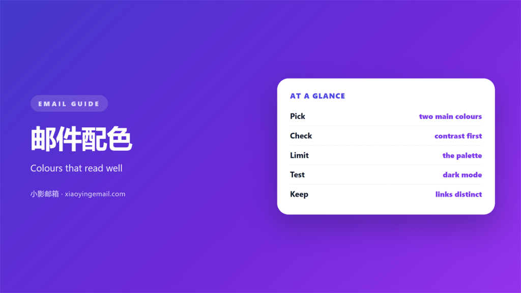
- 邮件配色 carries meaning long before the text is read.
- A calm base with one accent reads best.
- Check the contrast between text and background.
- Test the colours in dark mode before you send.
- Use no more than three colours in one message.
What 邮件配色 means
邮件配色 is the set of colours used across a message.
It covers the background, the text and every button.
Colour is read faster than any sentence.
It can signal urgency, calm, warmth or caution.
A steady 邮件配色 makes a brand feel familiar.
Random colours make even a good message feel cheap.
Many teams copy a palette once and never check it.
A checked 邮件配色 keeps the message readable on any screen.
Contrast matters more than beauty here.
If the text is hard to read, the palette has failed.
Why 邮件配色 carries meaning
Colour nudges the reader before a word is read.
Red can warn, green can confirm, blue can calm.
Used without care, colour misleads the eye.
A clear 邮件配色 uses these signals on purpose.
Contrast first
Dark text on a light background is the safest choice.
Check the ratio between the two colours.
A weak ratio blurs the words for many readers.
Accent and restraint
One accent colour draws the eye to the action.
Too many accents scatter the reader’s attention.
Let the accent mark one thing and no more.
A restrained 邮件配色 feels calm and confident.
How to choose 邮件配色
Start from the brand, then simplify.
Pick one base, one text colour and one accent.
Write the values down so the team can reuse them.
A shared 邮件配色 keeps every message consistent.
Testing in dark mode
Many readers open mail in a dark theme.
Some clients flip light colours on their own.
Check that the text survives the flip.
Testing for access
Some readers cannot tell red from green.
Never let colour carry a meaning alone.
The best 邮件配色 works for every eye.
Common mistakes in 邮件配色
The first mistake is text too light to read.
The second is a button that blends into the page.
The third is too many colours in one block.
Another is a palette borrowed without a check.
A clashing 邮件配色 weakens a strong message.
Look at the message on two screens before you send.
Read it in daylight and in a dark room.
Sending and improving 邮件配色
Keep a written palette and share it. Consistency is easier to keep than to rebuild.
Pair the colours with the right type. The choices are set out in 邮件字体.
Check how the palette behaves in the dark. The rules sit in 邮件暗黑模式.
Fit the colours into the wider frame. The basics live in 邮件排版.
Make sure every reader can see the text. The standard is described in 邮件可访问性.
Then improve one part each month. Small edits beat a full redesign.
A calm palette is easier to read and easier to trust.
Keep a note of what worked. A good 邮件配色 never needs to shout.
Building a simple palette
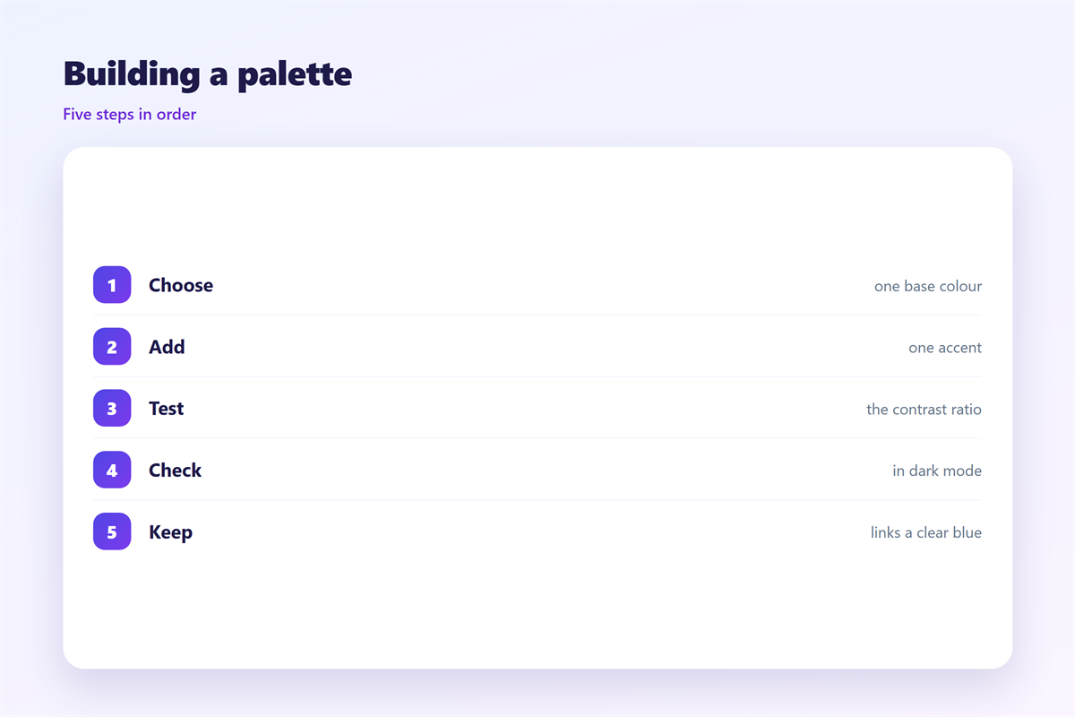
A palette is a small set of fixed colours.
Name each one so the team can share it.
A base, a text colour and an accent are enough.
Write the values as a short code.
Keep the code in a shared note.
Then no one has to guess a shade.
A fixed palette keeps a series consistent.
It also saves time on every new message.
Change it on purpose, not by accident.
A slow drift in colour looks like neglect.
Review the palette once a year.
Retire the shades that no longer fit.
Testing a 邮件配色
Contrast decides whether the text is readable.
Measure the ratio between text and background.
A free tool gives the number in a second.
Aim for four and a half to one or better.
Large text can pass with a little less.
Check every pair, not just the main one.
A button and its label need a good ratio too.
Weak contrast is the most common flaw.
Fix it before you fix the shade.
Legible text beats a pretty colour every time.
A quick test catches a costly mistake.
Run it before every big send.
Colour and mood
Warm colours feel friendly and close.
Cool colours feel calm and distant.
Bright tones shout. Muted tones whisper.
Match the mood to the message.
A welcome note can be bright and open.
A serious notice should stay quiet and plain.
The mood should support the words.
If the colour fights the text, the reader pauses.
A short pause is enough to lose attention.
Let the words lead and the colour help.
A calm palette reads as confidence.
A loud one reads as noise.
Checking on real screens
A colour can shift from one screen to the next.
A cheap panel may show a duller shade.
A bright phone may show a stronger one.
Open the draft on two different phones.
Look at it indoors and out in the sun.
The colour should hold in both places.
If it fails in one, soften the shade.
A safe colour survives every screen.
That is the test that matters most.
Beauty that works in one place alone is a trap.
Test widely and trust the plain choice.
A readable message always wins.
FAQ
How many colours should a 邮件配色 use?
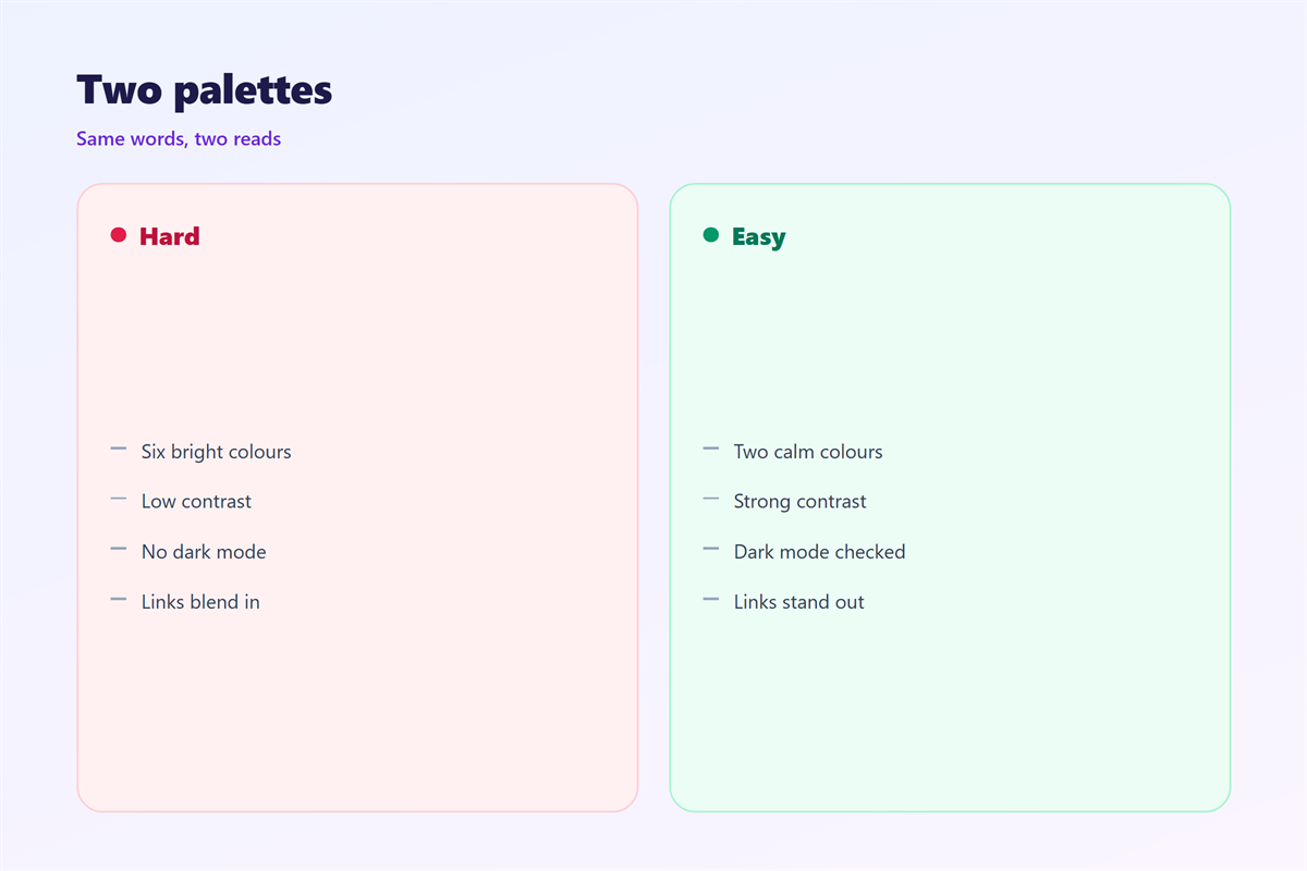
Three is enough. One base, one text colour and one accent.
What contrast ratio should I aim for?
A ratio of four and a half to one is a safe minimum.
Can colour alone show a button?
No. Add a shape or a label so it survives a dull screen.
Should I support dark mode?
Yes. Many readers open mail in a dark theme each day.
References
- W3C WAI: Understanding contrast minimum
- Litmus: Email colour and dark mode guides
- WebAIM: Contrast checker
延伸阅读
- 《邮件阴影怎么用?Shadows Used Softly》
- 《邮件对比度怎么调?Contrast That Reads》
- 《邮件品牌怎么体现?A Brand You Recognise》
- 《邮件渐变怎么用?Gradients That Stay Calm》
- 《邮件色块怎么用?Blocks of Colour》
- 《邮件装饰怎么加?Decoration With Restraint》
- 《邮件图表怎么画?Charts That Explain》
- 《邮件贴纸怎么用?Small Marks of Delight》
- 《邮件纹理怎么用?Quiet Patterns》
- 《邮件暗色模式怎么适配?When Dark Mode Wins》
- 《邮件品牌色怎么定?Colour That Stays Yours》
评论
还没有评论,来说两句吧。
评论功能已关闭。